

A latency map would be interesting to non-technical team members, they would be able to have a visual representation of the average packet transfer between nodes of a circuit but represented by something more understandable. Something very similar to what you would see on a normal traffic map.
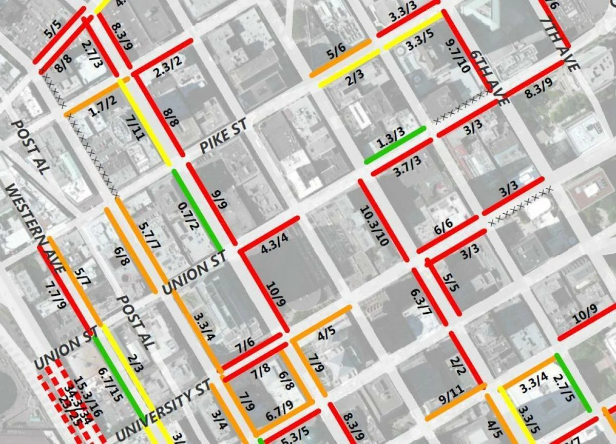
Essentially we would capture packet information over say 10 or 20 minutes and . Each circuit would have a color defined for thresholds of packet transfers as well for slower or higher speed transfer rates. -down circuits showing red, slower circuits showing orange, faster circuits showing green.
Also would be nice to use this to show circuit saturation- meaning Its a 10gig port that is consistently pushing 10gig of fragmented data. as opposed to a circuit that is pushing almost no data per second. Would be interesting to display it on a circuit with a sort of animated pulse showing the particular "speed" of a circuit - Similar to something like this:
https://miro.medium.com/v2/resize:fit:640/format:webp/1*tf0ZfDAcMxibL1mbZVP_XA.gif